Went back to the BNE today to spend some quality time
with a 16th century text on the history of the Dominican Order in
Aragon. So cool! When I first requested the text, it said it was in the general
Recoletos collection – I usually
associate this with modern publications, considering there is a whole separate
area, the Sala de Cervantes, for rare books and manuscripts. So I was very
surprised when they brought me one of the actual original copies of the book,
printed in 1599! It was a really exciting surprise and I tried not to act like
a fangirl when they handed it over to me trusting that I'd take it back to my
desk and treat it properly. No biggie.


Awwwwwww Yeah! Cradling/carrying it back to my desk. This is gonna be good.
In St. Louis, to
view a book from the 16th century would require going to the rare
books room, filling out paperwork,
setting up foam book supports to cradle the text, and being watched like a hawk
by the librarians. Here, for this copy anyway, not so much. And I'm not quite sure why. The binding may
not be original (Though I'm sure in age it's closer to 16th century
than it is to the 21st), but the pages certainly are, and they're
gorgeous. I'm not really sure why this copy is in circulation while others are
in the rare books room or the archive, but my best guess would be that it has
to do with the later binding? I have a hard time imagining it's just their
crappiest copy that they don't mind passing around, because this text is in SO
MUCH better condition than the copy Google worked from when they digitized the
book recently – Google's is a water-stained mess and the printing clarity isn't
very sharp. I'm glad I didn't rely on just reading the internet's copy, because
this was a really wonderful experience – the book itself is in much better
condition than the one online, and it's far easier on the eyes to read through
for hours at a time. PLUS, it's cool! And there were little interesting tidbits
and a bit of marginalia unique to this copy alone that I would never have
gotten to appreciate otherwise. I might want to check out the other copies of
this same text in the libraries holdings, to see if they have anything unique
to offer too. Plus it'd be a good excuse
to get my feet wet in the Sala de Cervantes, which I really need to do.
Okay, so yesterday when I looked at this book, I'd
forgotten my iphone for the day, and couldn't take any quick pics to post. But
I didn't make that mistake twice, and today I snapped away so I could share the
fun with all of you. I hope you find it as interesting as I did!
Let's get started: The book has a rather unassuming cover, but BAM, a pretty impressive title page. If you look closely, you can tell the cover of the book has been made with vellum, which pretty much will last until the end of time. I assume this is not the original cover and binding for this text, but the fact that it's made with vellum means it's certainly not a modern binding.


Isn't that a sweet shield?
The book is the Historia de la Procincia de Aragon de la Orden de Predicadores... by Francisco Diago

An interior binding detail

Now into the book! Here's the prologue page, dedicated to the reasonable reader
Check out the pointing guy in the Q! Isn't he amazing?
This text was full of beautiful details like the historiated initial above. (A historiated initial is a letter that has a picture inside - aka, the best kind of letters.) I took a picture of this Q specifically, but as I was looking through my photographs, I realized I'd inadvertently captured a lot of other beautiful initials as well. The following aren't 'historiated' initials, merely 'decorated initials' or 'illustrated initials' but they're very lovely. So I clicked through the images and copied/cropped any that had initials in them to show you a few more. It might be a fun side project to collect images of initials from books I consulted. Maybe I could get a whole alphabet by the end of my trip! Unlikely, but it might be fun.

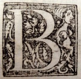


I think the E and the L were each especially lovely.
Wish I'd paid more attention to the other initials as I was going through!
But initials aside, the book had a lot of other beautiful decorated elements to enjoy. Like this gorgeous banner above this index of martyrs:

Fancy!
Or the way the end of the prologue tapers into a decorative point, followed by an intricate decoration:

But more so than the lovely early modern printed decorations, I was excited by the text itself. So let's dive into that! Here's page one. Well, technically, it's "Folio one, Recto." This book's pagination is not by page, but by folio, and only the recto (the front side) of each folio is numbered. So the back of this page isn't "page two," it's "Folio 1, Verso" (back side). So by our modern standards, this book has twice as many pages as it's numeration claims. Hah.

This first page has everything! A beautiful banner, italic and regular fonts, marginal notes, a decorated initial, a stamp pasted in stating its provenance as part of the "Biblioteca Real" collection (see the BR with a crown on top above the illustrated L)... what more could a book nerd want!?!
While we're on the subject of pagination, I want to point out this other neat and practical feature of early modern books. To aid in the assembly, and ensure that the pages were put together in the right order, at the bottom of each page, they printed the first word that will appear on the following page. Check it out:

This page notes that the following page should start with "Ami" ...

And so it does! Good job assembling this properly, 16th century printer.
Now, I've structured this post to get more obscurely nerdy as it goes, so feel free to ditch at any time if you're getting bored. But anyone who's taken medieval paleography will probably get a kick out of some of the holdovers from medieval abbreviations in the Early Modern period. Now, medieval books were handwritten on vellum, (calf skin) which is extremely expensive. Common words were abbreviated or given symbols to save space. However, this practice continues in the first century or so of early modern printed books, even though, since the change was made to paper, there's no concern about saving space. Just custom I suppose.
The most common abbreviations in this book were a dash above a letter indicating that the following "n" has been omitted. The highlighted words here are "con" and "aun"


Also, how pretty are these italic ampersands? Totally resembles "et."
I also LOVED encountering the notes left behind by past readers. There's one commentator who took it upon himself, to
(A) Make corrections (here substituting "Arnaldo" where "Alberto has been printed)

(B) Provide suggestions for further reading

(C) Get all worked up and point out "homicide!" during the description of a friar's death:

(D) (my favorite) Leave his own strong opinions about Ramon Llull:

This last contribution was my favorite, because something interesting happened. Here's how I sorted out what went down - let me know if you agree.
You see, this page has a tear in it. At first I thought maybe some of this scholar of yesteryear's marginal notes had gone with it - see the "o" on the other side of the tear, suggesting that the first line of writing is incomplete, and part is now missing? I was bummed. Until I noticed that the following lines all negotiate around the tear. The tear must have been there before the scholar made his notes. But then what's up with that first incomplete line?

Then I saw a piece had been cut out of the next page, but still had some evidence that something was once written there, and then cut away - see what looks to be the bottom bits of letters written in brown ink?

It seems the scholar started writing, didn't realize there was a tear in the page, wrote his line, realized part of it had gotten onto the next page, removed the mistake from the next page by cutting it away, and continued his rant on the next line, this time negotiating around the tear.
These kinds of little quirks are SO amusing to me.

The two fated pages
Anyway, these are things only a codicology nerd would love, but, that's me.
I also found someone else's notes tucked away, forgotten for who knows how long between the pages. The handwriting is different, and I have to assume these notes are newer than the ones written so neatly onto the book in brown ink, because these are scrawled with a blue ballpoint pen.

Anyway, if you're still with me, I hope you've enjoyed my little tour through all the bits of this beautiful old book that so delighted me. I hadn't checked it out to view its initials, abbreviations, binding, or marginal notations though. They were fun bonuses, but I'd really gotten the book to read a 16th century account of the medieval history of the Dominicans in Aragon. And it was a very useful text in this regard. As Dr. Garcia-Serrano pointed out to me, oftentimes, despite their biases and problems, these 16th century early modern historians had access to sources that simply are no longer extant, and can be a great resource to historians of medieval Spain. So I was scanning the book for discussions of issues related to my dissertation. And I was rewarded for my patience, because there were mentions of Ramon Marti scattered throughout! Plus there was a whole section just on his life, so that's a great great source to have. :-) Time well spent in the BNE!
My favorite part of the book was finding out that it was going to be a really useful source for my dissertation.These selections of the text may not have had gorgeous decoration or interesting codicological tidbits, but it was nevertheless a thrill. Check it out - one of the parts that mentions Ramon Marti!


Needless to say, I was a happy book nerd today. <3
Maybe leave an eyelash in one of the pages...for future book nerds to ponder!!!
ReplyDeleteReally enjoyed looking aat the art in the letters you posted, so beautiful!
ReplyDeleteOutstanding!
ReplyDelete